
3 Primaries 2 Hues 19 Brands LIMITED PALETTE TEST
Lately i had more my steer-wheel in my hands than my paint brushes. But that’s all over, and i’m back in my studio.
Dark shadows as cut by a knife, green disappeared by a burning sun, blues and turquoise all over the place… these souvenirs are gone. Earth colours introduce themselves in the green of the leaves, roses become small and rare and my agapanthus dont show any subtile blues any more, their stems shows only big green seed caps but the chrysanthemums are preparing their autumn flowers.
All over the heat waves, Brittany in a Mediterranean dress, welcome to the Bretton drizzle . Greens are loosing their blues and turn yellow, orange and ocherish. Clouds are charged with indigo and indanthrone …
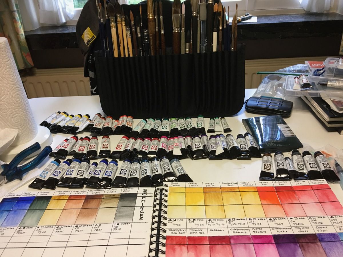
Let’s stop this ! All these impression could make a nice watercolour series, but these changes inspired me to show you the behaviour of primary colours using colour-wheels. I used the same Fabriano Aquarello 8” 1/4 x 11” 3/4 300 g watercolour sketchbook to create them. Then i used the 3 primary colours in 2 shades, one warm and one cool, that are in my studio.
I scanned these paintings with the same epson scanner using all neutral settings for all of them, without any correction neither in the scan software, neither in post production. I only used cropping and redressed some of them.
Sometimes for some brands i didn’t had the right colour in my drawer, so i replaced them with another close to the one i would have picked. Only for Maimer Blu i had to realise a only 3 colour wheel as i only had their starter kit with just one blue, one yellow and 1 red. For other brands it was difficult or impossible to know the composition and pigment, so i trusted my painted colour swatches to choose from.
Most of the time i only used fresh paint from the tube, but for some brands, as Rembrandt by Royal Talens, i only have paint boxes with half pans and pans. I will mention it in the description if i used pans, and if it not mentioned, the paint came from a tube.
But don’t take my word for it … Ancient romains knew it … “de gustious et coloribus non est disputandum” (traduction is a matter of taste, and, as we all know, there is no arguing with tastes. ) so don’t take my words for the only thruth. I happens frequently to me to change my palette colours depending on what i paint and the technique i want to use. But my 6 primaries always stays in my palette. They are the basic workhorses …
Let’s see how it worked out
BLOCKX
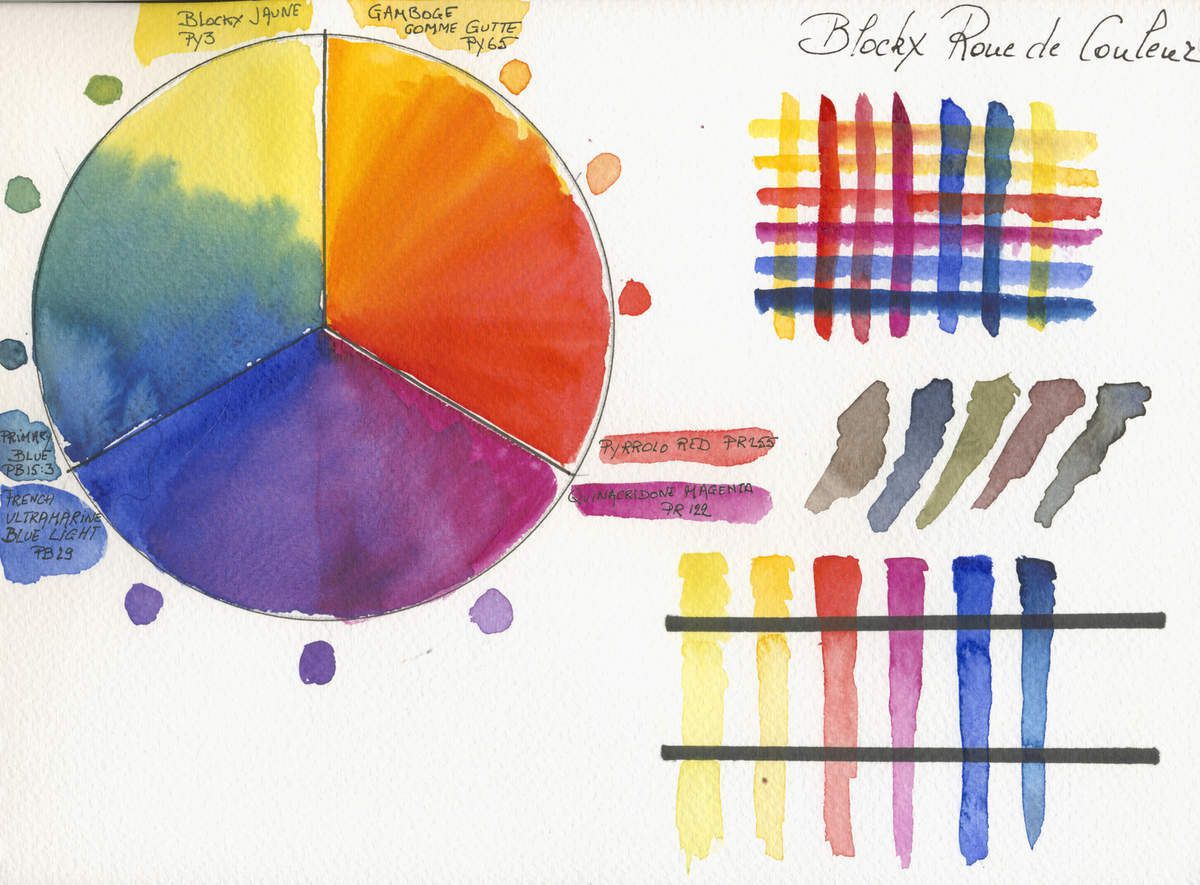
Description of the Belgian Manufacturer
WATERCOLOURS EXTRA-FINE WITH HONEY
Blockx' watercolors still maintain secret splendour and are still composed of the finest ingredients, blended today in the same deliberate manner as did craftsmen of the past.
Rare, tough pigments are thoroughly crushed, then coated in gum arabic and honey.
They come to you, today, in 72 brilliant shades.
We do not and never have prepared transient or unstable shades. A classification by degree of stability would, therefore be out of place.
Our watercolors are available in :
- 1/2 pans and giant pans
- Tubes of 15 ml and 35 ml
- Assortments
My observations
I Like
- Colour is very intense et they dissolves easily and run marvellously
- Mauves and violets created with this mix are very subtile
- The mixed oranges are very variated with nice hues
- Mixing the 6 primaries make very vivid greys
- Les glacis sont précis, les couleurs ne se mélangent pas et il y a une excellente transparence
- Glazings are very precise and colours don’t mix once the dried, the glazes are very transparent
I didn’t like
- Les verts sont limités, le côté froid de la roue n’est pas à la hauteur comparé au côté chaud.
- Les pigments ne courent pas trop, ce qui laisses voir les traits de pinceau
COTMAN by Winsor & Newton
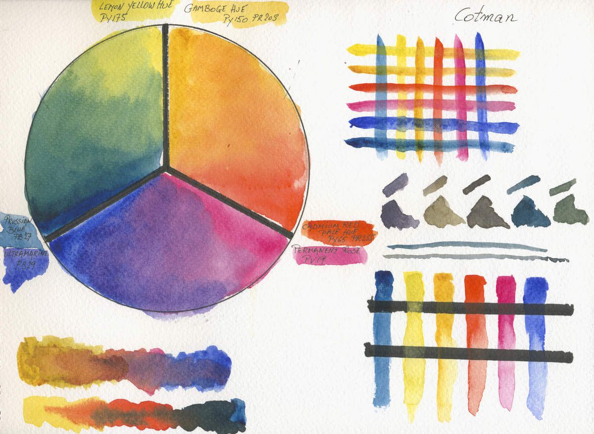
Description of the British Manufacturer
Our ever popular Cotman Water Colours come in 40 beautiful tones.
They're affordable but uncompromising on quality - they have excellent tinting strength and are easy to work with.
You can find them individually or in one of our water colour sets.
Our watercolours are available in :
- 1/2 pans
- Tubes of 8 ml and 21 ml
- Assortments
My observations
I Like
- Colours are quite intense for student grade paint et they dissolves easily and have a good spread
- With 40 hues the offer is quite reasonable
I didn’t like
- The mixes aren’t very graduated and are quite uniform
- When glazing, the yellows bleed with the blues, the reds are also bleeding in the blues but than the yellows
- As most compositions are hues (Different cheaper pigments are used to produce one pricier one), it’s quite difficult to obtain nice neutrals
- The lack of vividness, shine or luster compared to the Artist grade extra fine watercolours
- Few mono pigment paints in the range of tones. Easily turns to mud, mixing hues
DALER ROWNEY Extra Fine Artist Quality
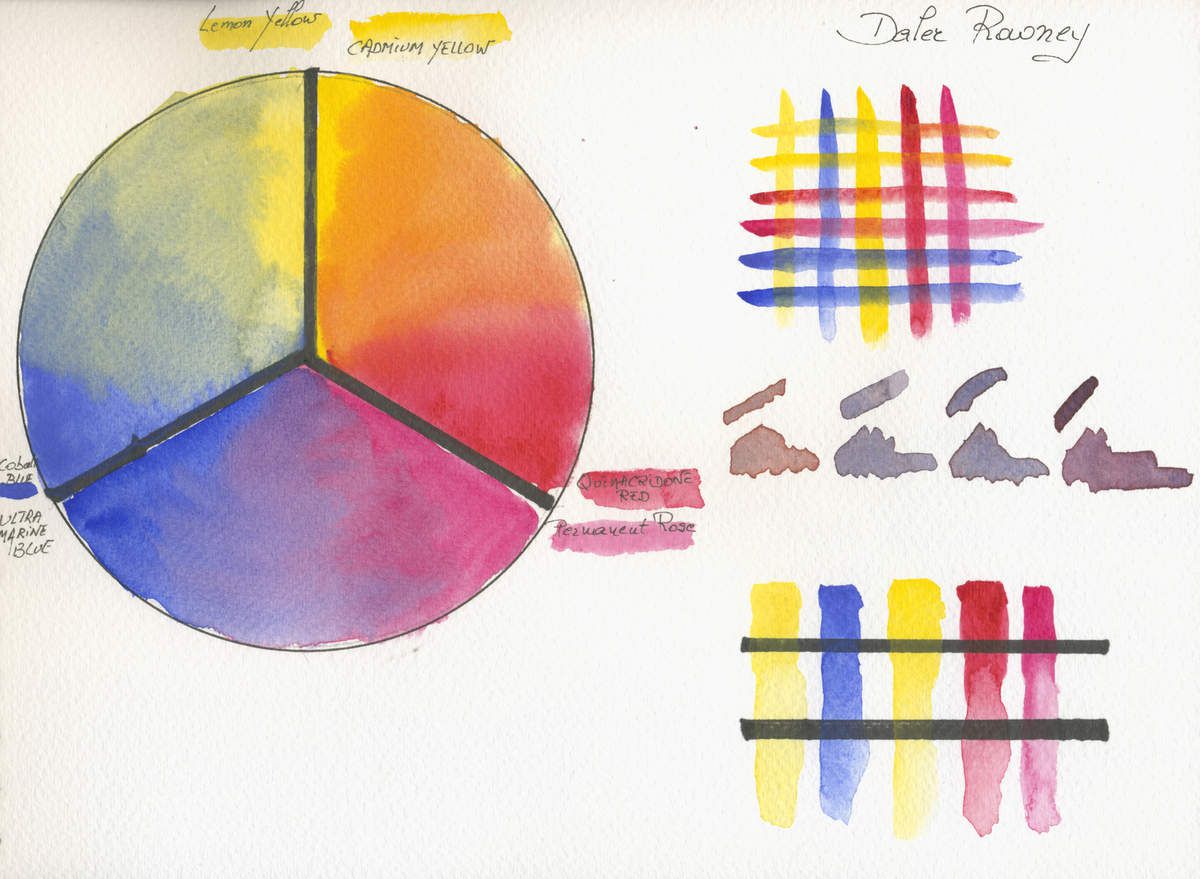
Description of the British Manufacturer
Artists' Watercolour
Artists' Watercolours are characterised by their rich, free-flowing colour, which never leaves any hard lines at the edge of a wash.
Their unparalleled performance is a product of precise formulations, based on the suspension of the very finest quality pigments in an aqueous solution of gum Arabic.
Only the best pigments, regardless of cost, are used in the manufacture of Artists’ Watercolours.
Tinting strength:
Artists’ Watercolours are formulated to maximise the varying tint strengths of different pigments.
Daler-Rowney Watercolours are offered in three ranges – Artists’ Quality, Aquafine and Simply.
Artists’ Watercolour is a professional-quality watercolour. Based on the finest modern and traditional pigments, it is precisely formulated to offer unparalleled performance and permanence. Choose from an extended range of brilliant colours, designed to create perfect washes of pure transparent colour without hard edges.
Students and leisure painters may prefer to discover the art of watercolour using Aquafine, which offers brilliant free-flowing colour at an economical price. Like the oil range, this is achieved by the substitution of some of the more expensive pigments with lower-cost alternatives and is indicated by the word ‘hue’. Use with Aquafine brushes and the Aquafine paper range for maximum effect.
Our watercolours are available in :
80 colours available
- 1/2 pans
- Tubes of 5 ml and 15 ml
- Assortments
My observations
To create this colour wheel i used a paintbox with half pans i bought more than 3 years ago. Compared to other extra fine artist paint, Daler Rowney seemed very poor in pigmentation to me. Is it the age of the paint that’s involved ? I’ll will try to get some tubes and redo this colour wheel with fresh tube paint. When done i’ll update this article.
I Like
- Colours dissolve easily and have a good spread
- With 40 hues the offer is quite reasonable
I didn’t like
- Not very pigmented
- When glazing, the yellows bleed with the blues, the reds are also bleeding in the blues but than the yellows
- The lack of vividness, shine or luster compared to other artist quality brands
- A traditional range of watercolours without much innovation
DANIEL SMITH

Extra Fine Watercolours
Description of the American (US) Manufacturer
For over 30 years, DANIEL SMITH paints have been formulated, produced and packaged in Seattle. When you use a DANIEL SMITH product, you support a community whose passion for color and quality has fueled some of the most inventive developments in the art materials industry.
DANIEL SMITH currently offers 232 different watercolours, with more in the works every year. The sheer range of possibility they offer is endless and unparalleled in the industry. Their amazing selection spans the spectrum from the historical, to the natural earth and PrimaTek colors, to the Quinacridones, the brightest and boldest colors modern technology has to offer.
Each year more of Dainel Smith's chemist’s inventive creations are introduced. Early on, DANIEL SMITH Inc. was the first to offer Quinacridone pigments in artists’ paints. These fantastic, powerful colors, originally created for the auto industry, gave artists new and vibrant choices perfect for glazing. A buying frenzy ensued, and since then, these colours have been copied by other paint manufacturers. After all, imitation is the sincerest form of flattery.
Our watercolours are available in :
232 colours available
- Sticks
- Tubes of 5 ml and 15 ml
- Assortments
Site link http://www.danielsmith.com/ItemList--Daniel-Smith-Extra-Fine-Watercolors--m-1404
My observations
I Like
- Colours are very vibrant, concentrated and radiant
- With 232 different colours Daniel Smith has the biggest collection of tints in the world
- Pure pigments that create nice neutrals and easy to variate
- innovation sorting new colours regularly
I didn’t like
- The lack of subtlety of the colours they can become very agressive, dominating
- Glazing isn’t the best property of this brands, even when the first layer dried for more than a day, colours mix and tend to bleed.
- Tubes are often charged under pressure ? When opening a fresh tube, more than one on five, the paint pops out, impossible to close the tube without messing everywhere.
Dr. Ph. Martin’s
Hydrus Extra Fine Liquid Watercolours
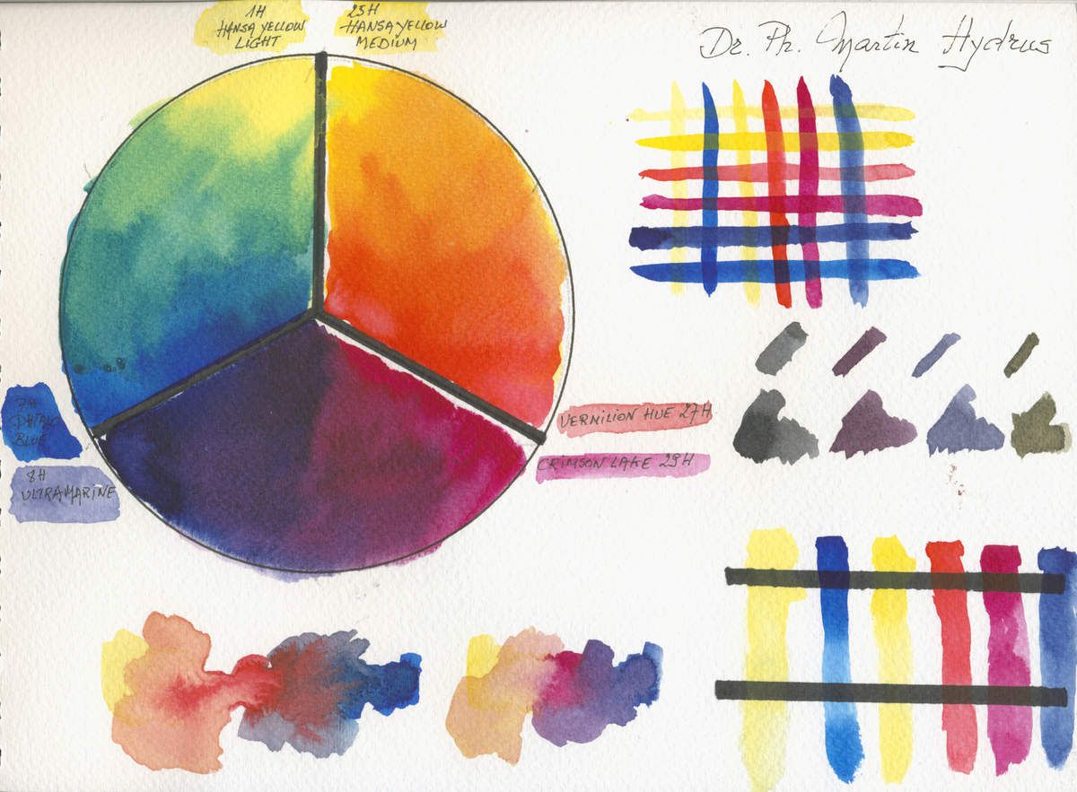
Description of the American (US) Manufacturer
Since 1934 Dr. Ph. Martin’s has specialized in putting the tools in the hands of artists that allow them to create their life’s best work. For over 80 years chemists at Dr. Ph. Martin’s have worked tirelessly on creating the best liquid watercolors, inks, and other color products. Dr. Ph. Martin’s products are world renowned for their vivid colors, special properties, and ability to work across mediums.
The iconic round and square glass bottles come in sets of twelve or fourteen, giving artists an unparalleled dynamic range of brilliant colors to work with. Dr. Ph. Martin’s dye and pigment based products let you experience a range of color otherwise unattainable through its products Radiant Concentrated, Spectralite Liquid Acrylics, Hydrus Fine Art Watercolors, Iridescent Calligraphy Colors, and Bombay India Inks.
Dr. Ph. Martin’s products are manufactured in the USA by Salis International, Inc. in Golden, Colorado.
Our watercolours are available in :
36 colours available
- Bottles 15 and 30 ml - 1/2 and 1 oz
- Assortments
I Like
- Colours are very vibrant, concentrated and have a great flow
- Mauves and violets created with this mix are very strong
- The mixed oranges are very variated with nice hues
- Mixing the 6 primaries make very vivid greys but quite difficult to master
- Les glacis sont précis, les couleurs ne se mélangent pas et il y a une excellente transparence
- Ideal for preparing pouring colours
I didn’t like
- Not so transparent as indicated by the manufacturer
- Lack of information, pigment composition is not always indicated, neither does the composition as pigment and water won’t make a stable liquid watercolour, what is used ?
- Quite difficult to find the good dilution grades and impossible to put them in a travel palette. Only useable in the studio
- Pricy and hard to find in Europe
HOLBEIN Artist’s Watercolour
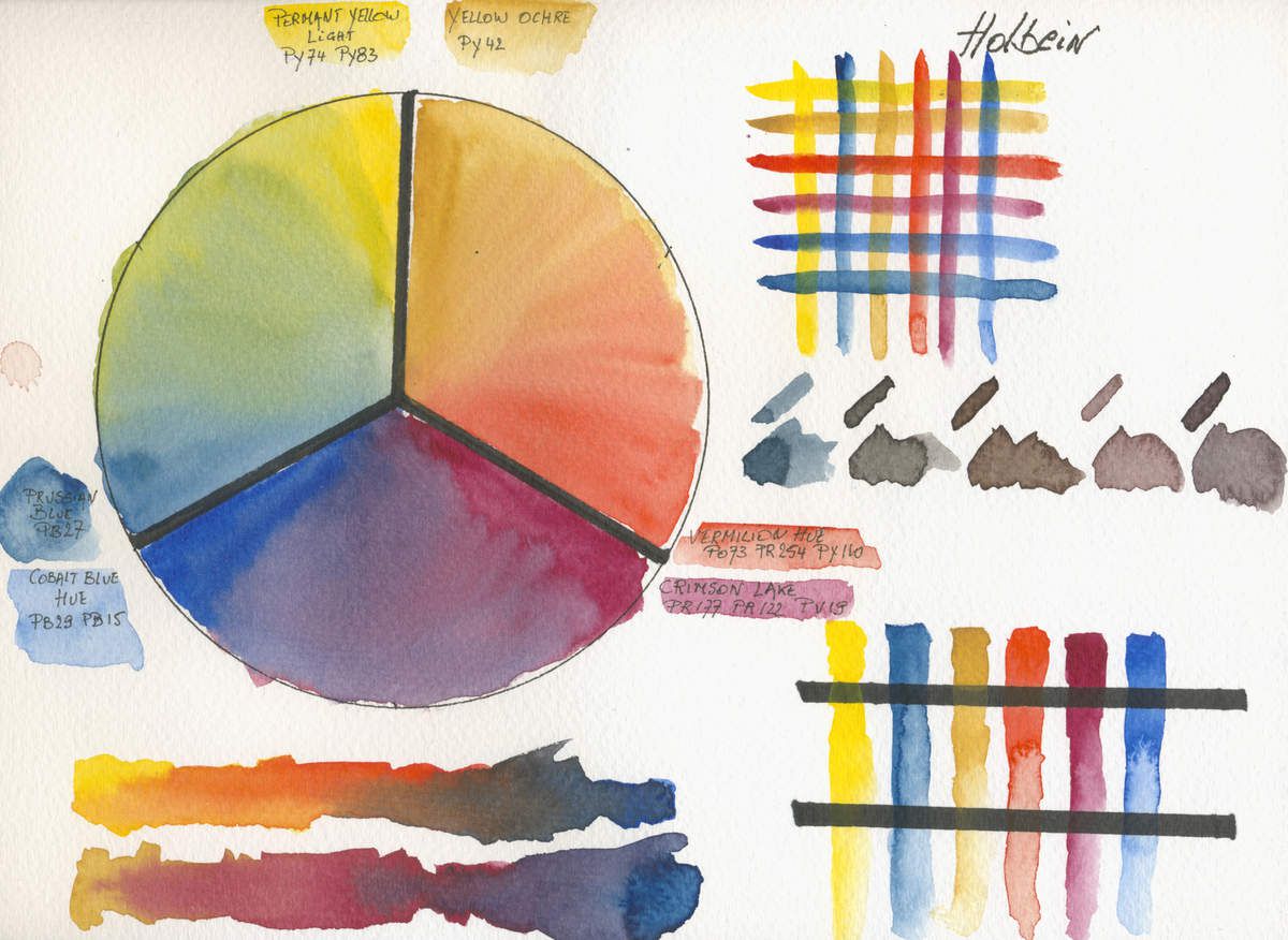
Description of the Japanese Manufacturer
Much of the incomparable, world-wide reputation that Holbein enjoys is due to the exceptional quality of their Artist Watercolor.
Originally introduced in the early 1920’s and now available in 108 highly concentrated colors, Holbein Artist Watercolor is a European style transparent watercolor which preserves the brush handling qualities inherent in Japanese watercolor techniques.
More finely ground than any other artist watercolor, Holbein Artist Watercolor is produced without ox-gall, animal by-products or other dispersing agents. This affords the user greater control in the dispersal of their pigments, enhances handling qualities and delivers color of unequaled intensity, purity and reliability for brilliant transparent washes and/or powerful, clean darks.
Holbein Artist Watercolor is available in two formats, in tubes (5 ml and 15 ml) or in a limited range of half pans. Holbein Artist Watercolor is specifically designed to rewet instantly and not deteriorate in the tube, pan or palette.
Holbein Artist Watercolor is the standard by which all others are measured against.
Our watercolours are available in :
108 colours available
- half Pans
- 5 & 15 ml Tubes
- Assortments
Site link http://holbeinamerica.com/#Watercolors
I Like
- Colours moisture and dissolve easily and have a good flow
- With 108 colours the range is optimised
- Mixing the 6 primaries to make vivid greys is quite easy
I didn’t like
- Lack of shine (binder ?) and poor on pigment concentration (compared to other top brands)
- When glazing, the yellows bleed with the blues, but less than most paints. They are quite transparent but there is quite a domination of some colours (Cobalt Blue Hue and Crimson lake … but these are not mono-pigment colours)
- Not really “European” watercolour, tend to be more oriental opaque and use of hues and misleading information… Cobalt Hue doesn’t use the cobalt pigment (PB28-PB74-PB36) but use Ultramarine PB29 and phtalocyanine PB15. So mixing with these colours regarding their names will produce strange effects.
- Because this inconsistency and claiming “Traditional European Paint”, it seems to me that they use a compromise between more gouache like eastern binder and western arabic gum, honey and glycerine binder. I think it’s better not to mix and if you’re looking out for this japenes touch better look out for the Gansai Tambi paints of Kuretake.
ISARO
Extra Fine Acacia Honey Watercolours

Description of the Belgian Handcrafted Manufacturer
I was born to an artistic family and creators of colours. I have inherited the passion and their specific expertise.
I always had a strong passion for l’history of colours and the use of pigments. In 2008 i decided to breathe new life into this heritage.
So i created using the brand name ISARO (ISAbelle ROelofs) a range of oil paints using traditional and modern, contemporary pigments, selected with my know-how and family tradition.
So i went on and studied, tested and did a lot of research on creating a watercolour line, collaborating with a professional watercolour artist. ISARO extra fine honey based watercolour paints line were launched in 2011.
I’m also the co-writer with Fabien Petillion of the book “La Couleur expliquée aux Artistes” (Colour explained for artists), realised by Editions Eyrolles in 2012. ( No traduction in english is available at the moment Editor's Note )
Why should i use ISARO ?
I attach particular importance to the quality of my paints
Each colour is created including the maximum pigment concentration
The shine, vibrancy and luminosity are very carefully looked after as the light resistance and lightfastness.
Our watercolours are available in :
45 colours available
- Tubes 7 and 21 ml
- Assortments
Site link http://www.isaro.be/shop/
I Like
- Colours are very vibrant, concentrated, creamy consistence and have a great flow
- Mauves and violets created with this mix are very subtile and create a large range of possibilities. I observed the same for the greens
- The mixed oranges are very variated with nice hues
- Mixing the 6 primaries make very smooth and rich greys that can easily be modified by adding a tiny amount of ne of the primaries.
- Les glacis sont précis, but the yellows tend to bleed if used over blues. The glazes are very transparent
I didn’t like
- I’m still looking out for some negative particularities … maybe that we have to look out carefully for back runs as they do produce themselves easily, because as other top brands the more pigmented the paints are the easier it is to create blooms, cornflowers or back-runs
- Not easy to find in specialised stores, but ISARO sells worldwide through their web site.
KURETAKE GANSAI TAMBI
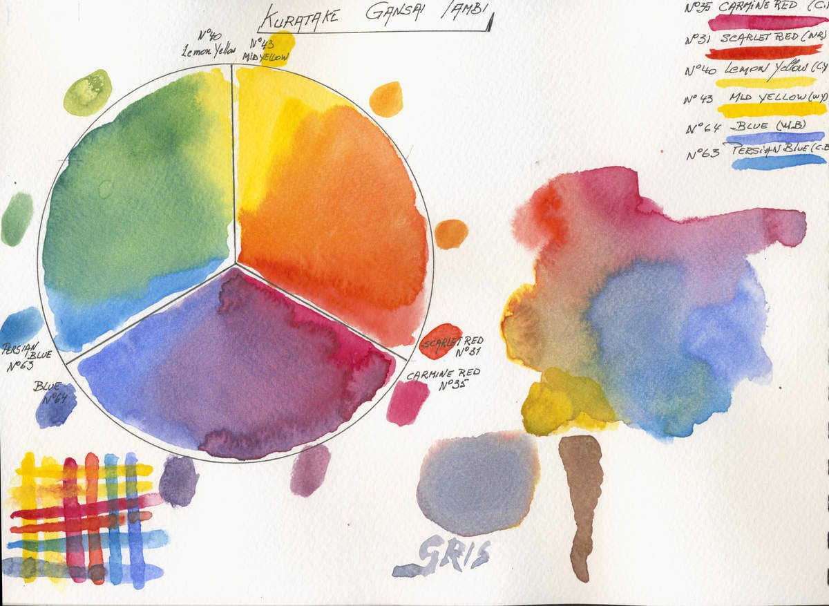
Japanese Watercolours
Description of the Japanese Manufacturer
The rich and intense colors of Gansai Tambi are handcrafted, professional-quality pigment inks. These fine-caliber watercolors are highly blendable, with a creamy-smooth consistency found only in traditional Japan.
Gansai Tambi watercolors are available in different sizes. The 6, 12, 18, 24, and 36 watercolor sets each include a vivid silver, gold, and bluish-gold color that resemble gouache paint.
Gansai Tambi watercolors have a glossy sheen finish and are perfect for crafters and artistic professionals. The high-density pigment of each color allows Gansai Tambi to be applied even to dark paper. Because the high density pigment, the colors – especially metallic – can be applied even to dark paper. To achieve a more traditional transparent effect, dilute the paints with water and blend until the desired consistency and opacity is reached.
Create dazzling metallic combinations by mixing silver and gold to colors of your choice. Use with the portable BrusH2o for blending and creating new unique colors or artistic washes. The possibilities with Gansai Tambi watercolors are endless!
Our watercolours are available in :
? colours available
Site link https://kuretakezig.us/watercolors/
I Like
- Presentation and packaging, it’s a nice gift to offer
- Large pans, ideal for washes with large brushes
- The price the 36 colour set doesn’t cost more than 4 tubes by Schmincke, Daniel Smith or Blockx
- The difference with traditional “Western Watercolours” that force us to change out painting techniques.
- Ideal sets for beginners, cartoonist and manga artists.
I didn’t like
- Hard to find traditional mixes and the mixes show little variation
- Tendency to become quickly opaque
- Dont use this paints for glazing as they lift very easily, creating mixes instead of glazings
- More useful for illustrators than for watercolour painters
- Some of the colours aren’t very saturated in pigment
- Hard to create neutral mixes
- Lack of information about composition and pigment use
M. GRAHAM
Extra Fine Blackberry Honey Watercolours

Description of the American (US) Manufacturer
WATERCOLORS:
M. Graham watercolors are created with exceptional amounts of pigment in a time-honored binding medium of pure gum arabic and natural blackberry honey.
Wy Honey
As an essential ingredient in our binding medium, honey contributes to moistness for smooth, easily controlled applications, increased pigment concentrations, and freedom from over reliance on preservatives. Because of the honey medium, our watercolor resists hardening on the palette, or in the tube. It dilutes easily, often after months of disuse.
Compare Our Color
We spend hours milling our colors to coax the highest pigment loads into our paints. Compare us. We believe you will agree, M. Graham makes better color.
Richer, More Vibrant Color
In order to make truly beautiful color you must load as much pigment as possible into the paint paste. More pigment makes the color more brilliant. More vibrant. It provides a vitality that can’t be achieved by manufacturers who get by with less.
We are constantly evaluating ourselves against the competition to see who has greater tinting strength and pigment loads. For this test, we mix a tablespoon of white, and half teaspoon of color. We make what we call draw downs, and we always put our color on the left, and the competitor’s color on the right.
What we find time and again is that no other paint offers the same level of pigment as ours. But don’t take our word for it- See the difference for yourself!
Our watercolours are available in :
68 colours available
- Tubes 15 ml
I Like
- Colours are very vibrant & concentrated
- Nice and equal flow
- Wet easily and rehydrate without problems
I didn’t like
- Manufacturer quite new on the art market so we have to wait ans see
- Mixing paint on the paper is quite hard specially when using wet on wet techniques without helping the mix
- The manufacturer indicates very good lightfastness but i didn’t test them and didn’t find any reliable source, so i take it with some reserve
- Difficult to find out of the U.S.A.
- Very pricy abroad (not in the USA), as charges for customers and shipping make them less affordable.
MAIMERI BLU
I’m sorry to be unable to paint a 6 primary colour wheel for this brand. I bought an introduction set with only 1 of each primary colours in it. I’ll try to add the others and when it will be done, i’ll post a revision of this article on my blog.

Extra Fine Italian Watercolours
Description of the Italian Manufacturer
Superior watercolours
The merit of watercolour lies in the transparency of its tints and the freshness of washes and drippings of colour. Any correction is hard, if not impossible.
The tones get lighter with the addition of water (not of white, which makes than chalky and opaque). It is the whiteness of the paper that illuminates this type of painting. The light is behind the colour.
Maimeri Blu features an absolute purity of pigments that, together with gum arabic, comprise the totality of the mixture. No blending powder, no additives: pure colours, pigments and nothing else.
Nothing harmonizes or synchronizes the gear change between the various colours. It is up to the artist’s skill to orchestrate and handle different characteristics, particularities and traits.
Our watercolours are available in :
72 colours available
- Tubes 15 ml
- half pans
I Like
- Colours are very creamy and dilute very easily
- Nice and equal flow
- Neutrals created with the 3 primaries are very nice, transparent and subtile
- Interesting price in Europe
I didn’t like
- The manufacturer indicates a high concentration of pigments, but my opinion is that they are less charged than most artist grade watercolours
- Glazing is very hard to perform (may on other paper ,) the yellow bleeds and the transparency is not one of the best.
- Lack of vibrancy, shine and brillance
Mijello MISSION GOLD
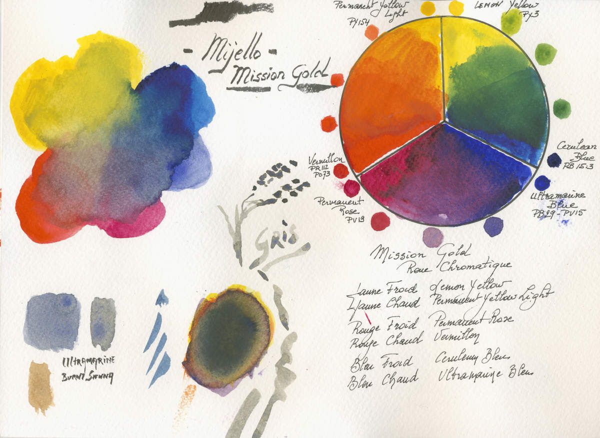
Extra Fine Korean Watercolours
Description of the Korean Manufacturer
Superior watercolours
For intensity and brilliance beyond compare, experience Mission Gold Watercolors by Mijello.
The super-premium watercolors that comprise this line were designed with the help of expert watercolor artists to mirror the pure, rich colors from nature’s palette.
Only the most progressive and highest quality pigments from around the world are selected for use.
In the continual strive for perfection many colors were recently reformulated for superior lightfastness so Mission Gold will better preserve your artwork’s original vivacity.
Mission Gold Watercolors are handmade by first mixing carefully selected pigments with premium mediums and dispersants and allowing them to naturally cultivate extraordinary color properties.
This process results in consistent color, strength and viscosity that artists can rely on. Mission Gold disperses quickly, beautifully, and evenly in water allowing the artist to better express true depth and perspective of multi-dimensional objects.
With more pigment and no thickener, a little color goes a long way and there is very little color shift from wet to dry.
For watercolor as vibrant as nature, go beyond your ordinary watercolor. Mission Gold is the watercolor that listens to you.
Our watercolours are available in :
105 colours available
- Tubes 15 ml
- Assortments with or without Mijello palettes
I Like
- Colours are very pigmented, rich and vibrant
- Nice and equal flow on palette
- Moisture and dissolve easily
- Interesting price in Europe, specially when bought in sets
I didn’t like
- The use of traditional names, but with hue or strange formulations of pigments
- Traditional mixing is an adventure as the pigments used aren’t the same as used by western watercolour manufacturers
- Some problems with lightfastness, but Mijello changed recently some of their formulations and pigments
- Hard to get shiny transparent neutral (due to the multi pigment composition of the paints)
- Doesn’t flow and mix well in wet in wet technique (has to be helped)
PÉBÉO
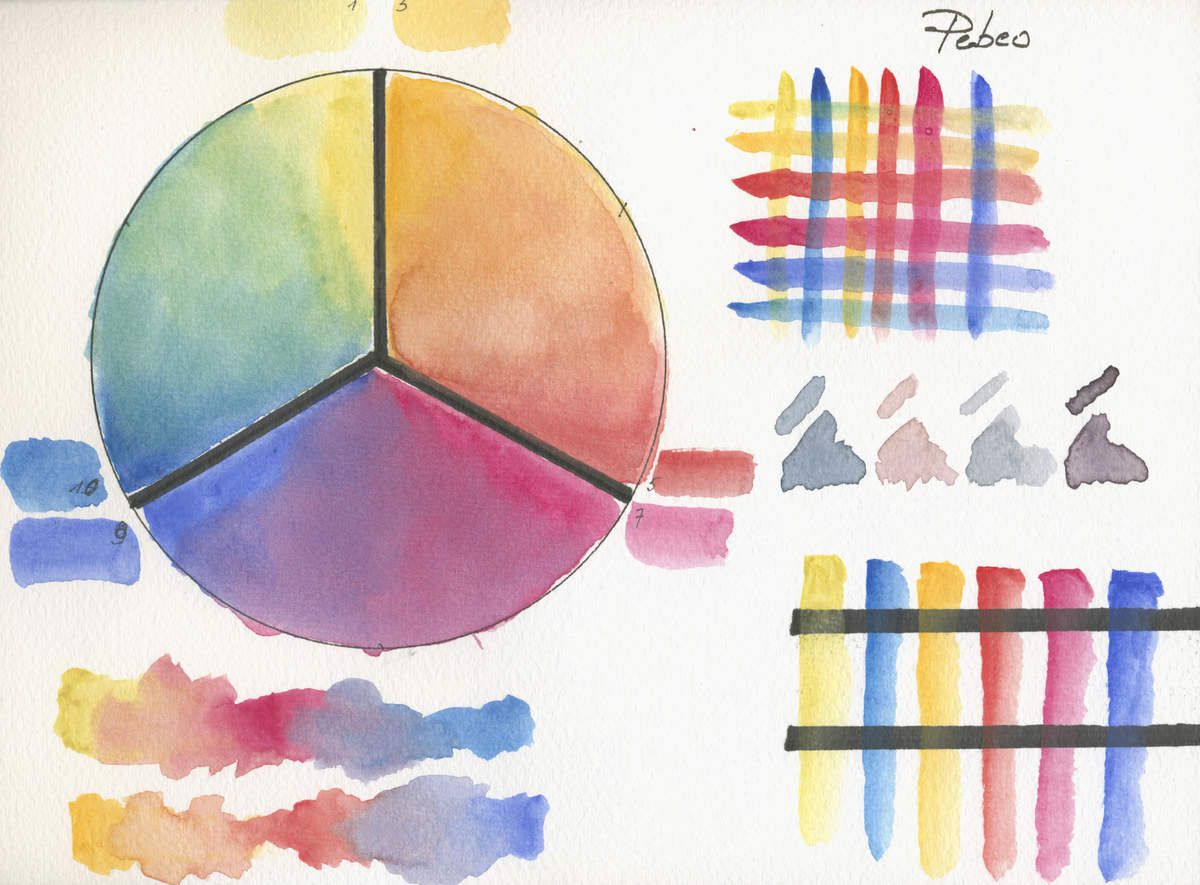
Fine French Watercolours (made in China)
Description of the French - Chinese Manufacturer
L’Aquarelle fine watercolours
The great masters of watercolourf irst emerged in the West around the sixteenth century. Their portability and timeliness made them ideal for illustrating the discoveries of the New World and later in the colonies.
Pébéo offers amateur watercolours via its Fine Watercolour range, a palette of bright and intense colours. The range of Pébéo watercolour auxiliaries will finally enable artists to enrich and expand their technique.
FOR BEGINNING WATERCOLOURIST
Pebeo's fine Watercolour range has been carefully selected to meet the needs of watercolour lovers, while designed in the tradition of Pebeo watercolour. The 28 colours of the range are easy to thin and provide a depth of tone and transparency that is retained when dry.
Our watercolours are available in :
28 colours available
Site link http://en.pebeo.com/Fine-Art/Watercolour
I Like
- Nice presentation in the round box, but that’s all. As a leader creating innovation in mixed media art supplies, Pébéo should also concentrate on watercolours and avoid to buy in China sets that doesn’t meet their other paints quality.
I didn’t like
- The use of traditional names, but with hue or strange formulations of pigments
- Traditional mixing is an adventure as the pigments used aren’t the same as used by western watercolour manufacturers
- To expensive for these “child quality” paints, student grade paints from other manufacturers are a lot better and even 1 dollar shop paints are better.
- Bleeding while glazing, lift to easily making glazing nearly impossible.
QOR by GOLDEN

Extra Fine Innovative American Watercolours
Description of the American (US) Manufacturer
Modern Watercolours
The unique formulation of QoR Watercolors accentuates the luminosity and brilliance of pigments even after drying. QoR provides the subtlety, transparency and flow of a great watercolor, with colors that have as much vibrancy and fire as the best acrylic or oil paint.
Choose from 83 high-intensity colors, including three Iridescent colors. The addition of QoR Mediums and Grounds can increase gloss, improve flow or wetting and provide different textured surfaces, to expand the creative opportunities in watercolor painting.
Our watercolours are available in :
83 colours available
- Tubes 5 & 11 ml
- Assortments
I Like
- Colours are very pigmented, rich and vibrant
- Nice and equal flow when applied without mixing
- Moisture and dissolve easily
- Strange mixing in wet in wet application (can be negative see here under)
I didn’t like
- Strange reactions between different colours, they have tendency not to mix but to engage a battle between them pushing and retracting one another
- Interaction quite disperse and unusual mixing with other brands
- Lightfastness is in question as this brand was created shortly, but the warranty of being produced by Golden should be a plus.
- Pricy in Europe and sometimes harder to find. Tubes are very small and have tendency to let the paint pop out when opening (as Daniel Smith does …) creating a mess.
- Easily creates blooms and back-runs
REMBRANDT by Royal Talens
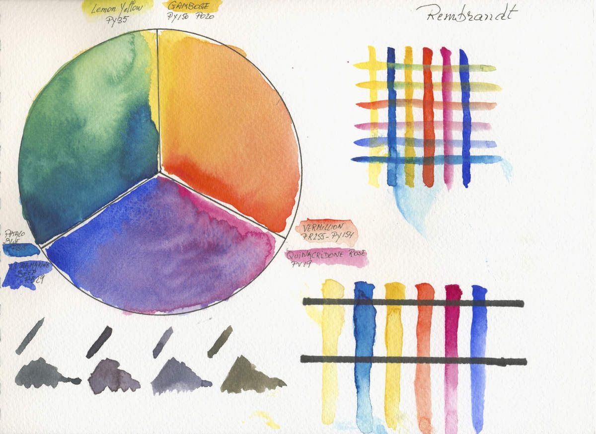
I bought the 48 half pan set to create this colour wheel. Is it because these aren’t fresh of the tubes paints that causes a less vibrant colour wheel ? I’ll look out to buy these primaries (and in mono pigment if possible) in the near future. When this will be done i’ll update this article. And why not include Van Gogh student grade watercolours at the same time.
Sign up to my blog and you’ll be informed every time i update or post a new article.
Description of the Dutch Manufacturer
Water colours
Watercolours are a transparent paint based on Gum arabic. Painting in water colours is a technique whereby the paint, thinned with water or as it is, is applied on special water colour paper. The paint has various constituents including pure pigments and Gum arabic, which ensures the pigments adhere to the paper. In contrast to gouache, water colours are always transparent.
Water colour
• Highest degree of lightfastness
• Very pure and intense colours
• Perfectly thinnable with water
• Maximum degree of transparency
• Finest pigments in a pure quality of gum arabic
• The complete range consists of 80 colours
80 colours available
Our watercolors are available in :
- 1/2 pans Tubes of 5 ml and 20 ml
- Assortments
Site link https://www.royaltalens.com/en-gb/products/water-colours/
My observations
I Like
- Very transparent and fine hue watercolour
- Nice even flow
- Price is better than Schmincke in Europe. (Commercial politics and marketing are close between these brands, although Schmincke innovates for his 125th anniversary)
I didn’t like
- Very traditional, not very innovative
- Glazings bleeds specially the yellows and the vermilion
- Lack of mono pigmented paint causing disturbance in some mixes
- The hues in the paints make creating shiny transparent neutrals quite difficult
- Creates, while diluted, blooms, cornflowers or back-runs
OLD HOLLAND
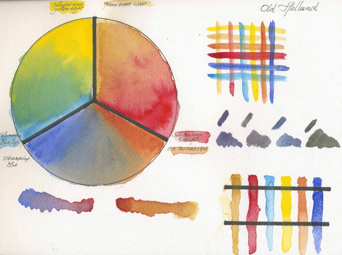
I bought some tubes from a garage sale and lately i added a starter kit from this dutch manufacturer. I hoped to find some of the best paints in the world (as some artists, magazines and bloggers pretend) but i was very disappointed. Is it because the lack of a warm yellow and a real cool red ? I have intention do redo this test in the future after adding these two tones to my palette.
Sign up to my blog and you’ll be informed every time i update or post a new article.
Description of the Dutch Manufacturer
CLASSIC WATERCOLOUR
The launch of the oil paint series in the unique range of 168 colours was followed by the Old Holland Classic Watercolours in the same rich range. One of the unique characteristics of these watercolours is the unparalleled colour strength (maximum pigmentation). And while this high colour strength requires a slightly different approach on the part of the aquarellist (so little paint is needed from the tube or cup for the desired colour effect that you have to get used to the ratio of paint to diluent), the advantages are clear.
It is well-known that Old Holland attaches a hand-painted colour strip to its tubes of oil paint and acrylic paint, showing the paint in the tube in question. However, a different solution was chosen for the watercolours. The labels of the tubes and cups of watercolour do not show the full tone of the paint, but the undertone (a logical choice following from the technique of watercolour painting). The colours on the labels are screen printed with the watercolour in this undertone, using a screen printing technique developed specially for Old Holland.
It is well known that some pigments used in watercolours display special characteristics:
Granulation: the pigment particles attach themselves to the paper as a splotchy tone. Examples of this include Manganese blue, Ultramarine blue dark and Raw Sienna.
Flocculation: pigment particles aggregate together, giving the same effect as granulation. Examples include Viridian green light and dark, Green Earth and Raw Umber.
The watercolour series also includes a number of opaque, supertransparent (with the suffix 'lake' in the name) and semitransparent colours. To view our range of 168 colours, click here for the colour chart. Click on the individual colours to display full technical information on the colour in question. Click here for our watercolour medium. For product codes, tube sizes, packaging, assortment boxes and more, please check our catalogues.
168 colours available
Our watercolors are available in :
- 1/2 pans
- Tubes of 6 ml and 18 ml
- Assortments
Site link http://www.oldholland.com/products/classic-watercolours/
My observations
I Like
- Very transparent and fine hue watercolour
- Nice even flow
- Glazes are very transparent et have nearly no bleeding
- Re wet easily
I didn’t like
- The use of too many multi pigment based paints, often using white and black pigments in their composition. Is this the result of using the same pigments as they use in their worldwide know oil paints ?
- Difficult mixing due too the use of multi pigment paint
- Leave marks when painting wet in wet (separation of pigments ?)
- Very difficult to avoid back runs and blooms
SCHMINCKE HORADAM

Description of the German Manufacturer
HORADAM® AQUARELL
Finest artists’ watercolours, series 14
The new, optimized and enlarged 140 assortment:
- 139 brilliant, intense colours + Oxgall: 100 unchanged tones, 35 new tones, 4 optimized tones in highest quality as always.
- 112 tones with highest possible lightfastness (4 and 5 stars)
- 95 one-pigment-tones for brilliant mixing results
- Enlarged colour ranges due to new pigment classes as well as 20 new pigments, e.g. quinacridone, perylene, transparent iron oxides
- Enlargement of the AQUA mediums assortment: 3 new mediums for more creative options
Well appreciated quality remains:
- Pans poured 4 times in liquid state for highest yield
- Especially selected Gum Arabic as binding medium
- Fully reusable paint when dried on a palette
- High control of paint flow, even on soft watercolour papers
- Quality assortment “Made in Germany”
- Same colour recipes for pans and tubes
- 139 colours in full and half pans as well as in 5 ml- and 15 ml-tubes
In the Jubilee Year 2017, Schmincke enlarges and optimizes - after some years of research by the Schmincke lab - the HORADAM® watercolours to the premium 140 assortment. The capabilities of newest pigments, the inclusion of customer wishes and market analysis, as well as changes in the raw material market gave us the impulse to perfect the assortment and to extend the colour range.
35 new colours, among these 32 one-pigment-tones, fill the harmonic colour spectrum of the HORADAM® premium assortment. The increased use of highly lightfast pigments, such as Quinacridone and Perylene, offers completely new possibilities for the artist. 10 new red colours, 3 new one-pigment violet colours, 4 new black tones and 8 new brown colours, partly transparent like e.g. Transparent Ochre or Transparent Umber, have been added to the premium assortment. The ultramarine range has been enlarged with the famous colour French Ultramarine.
100 well-tried and traditional colours as well as Oxgall – the wetting agent - already fit to the highest quality standards, so that there was no need for a change. 4 colours (with remaining shades) have been optimized using the newest and best raw materials. 6 colours are omitted due to raw materials which aren’t available anymore.
139 colours available
Our watercolors are available in :
- 1/2 pans and full pans
- Tubes of 5 ml and 15 ml
- Assortments
My observations
I Like
- Very transparent and fine hue watercolour
- Nice even flow
- Re wet easily
- Very nice accurate glazing although the lemon Yellow has a tendency to bleed with the Phtalo Blue
- Nice transparent subtile neutrals using the 6 primary colours
I didn’t like
- Really not so much, maybe because they are less vibrant than some paints from their competitors
- take attention the paint produces easily blooms and back-runs as most top grade paints do.
SENNELIER L’AQUARELLE
While creating colour wheels with 3 primaries and 2 hues i decided to show the differences between color wheels while choosing different basic primary hues. So i decided to show you 3 different colour wheels from one brand. The first one is the closest to all other colour choices i used for all other brands colour wheels.

Description of the French Manufacturer
HONEY-BASED WATERCOLOUR OF THE IMPRESSIONISTS
The roots of Sennelier watercolors are to be found in the Impressionist school. At that time, painters drew their inspiration from nature and set out to reproduce natural light. Watercolor technique offered spontaneity, lightness of touch, fluidity and transparency allowing a quick translation of a particular light, vibration or shape.
Paul Cézanne, for instance, produced forty or so watercolors of the Mont Sainte Victoire in Provence. Earlier on in England and on the Normandy coast in France, William Turner had turned painting in watercolors as an art form in its own right and had even managed to produce genuine masterpieces. Since then watercolors have become an established part of the history of painting. Artists love them because of their radiance and their spontaneity. It is such a pleasure when the painter plays with the light of the paper and the brightness of fleeting, intense pigments as they glisten, come together and swirl around under his brush producing a whole host of different effects.
A watercolor tailored to the needs of today's artists.
We spent a long time working with many different artists to produce L'Aquarelle Sennelier. We consulted watercolorists from all over the world. A panel of professional painters carried out "blind" tests on a number of formulations. They clearly revealed what they were looking for: a watercolor which is luminous, brilliant and intense. L'Aquarelle Sennelier fulfils their every wish.
A honey-based watercolor.
Honey has many virtues: a symbol of light and sun, an emblem of poetry and science and has been used since Ancient times as a remedy for dry skin and to help heal wounds. This nectar is used in L'Aquarelle Sennelier not only as a preservative but as an additive giving incomparable brilliance and smoothness to the paint. Always striving for excellence, Sennelier has reworked its watercolor formula with increasing the amount of Honey in the paint to reinforce the longevity of the colors, their radiance and luminosity.
Watercolors Made in France using traditional methods.
L'Aquarelle Sennelier has been produced in the same way for more than a century using the best pigments and top quality Kordofan Gum Arabic as a bonding agent.
This mix of natural ingredients produces colours which have a smooth, bright texture and offer lively, colourful shades. The Gum Arabic and honey combination offers incomparable quality of application, producing superb washes. Then, this base is mixed with pigments and carefully ground. Sennelier makes sure to wet the pigments in purified water (with no mineral salts) for 24 hours before mixing them in with the bonding agent. This improves the way in which the colours and bonding merge together, in turn bringing out the full beauty of the colours.
Sennelier watercolors are ground in the traditional way using grindstones rotating slowly so as not to heat up the paste. This operation is carried out in several stages until the paste are as fine as possible thus getting rid of any particles which might impair the perfection of the wash.
This exceptional and very high quality watercolor will help you make your works even more powerful due to the liveliness and purity of the hues. The colours mix together perfectly, offering superbly subtle shades. These smooth, intense colours will be a genuine pleasure to paint with. The addition of honey will allow the tubes and pans of Sennelier watercolors to stand up to the passing of time and each time you will paint with them you will be able to accurately translate the diversity of light shape and hues.
98 colours available
Our watercolors are available in :
- 1/2 pans and full pans
- Tubes of 10 ml and 21 ml
- Assortments
Site link http://www.sennelier-colors.com/en/Aquarelle-petite-aquarelle_85.html
My observations
I Like
- Very transparent and extremely variated watercolour
- Nice even flow
- Re wet easily
- Very nice accurate glazing although the lemon Yellow has a tendency to bleed
- Nice transparent subtile neutrals using the 6 primary colours
I didn’t like
- Really not so much, maybe because they are less vibrant, more pastel than some paints from their competitors, but is it really a con ?
- Separation of pigment and binder in the tubes. I noticed that opening 8 new tubes, i found at least one where the binder sat on top and was without any pigment. So the stability of the paint mixture in the tube can be better …
ST PETERBURG WHITE NIGHTS

I was very interrogated by this Russian brand and it was one of the first paint sets that i bought retiring and picking up my brushes again (since 40 years …) The most important thing about this paint is their price quality relationship that is one of the best on the art market. They became also easier to find worldwide
Description of the Russian Manufacturer
Water colours
The St Petersburg artist’s paint plant, that produces these wonderful watercolours, has been in existence since 1900.
Colours made in this factory have been used in the restoration of many famous Russian Palaces and Cathedrals, read more..
66 colours available
Our watercolors are available in :
- Full pans
- Tubes only in assortments (12)
- Assortments
My observations
I Like
- Very brillant and fine covering watercolour
- Nice even flow
- rewet easily
- Very nice accurate glazing although the lemon Yellow has a tendency to bleed
- Creates nice neutral hues
- The best buy if you’re financially on the edge
I didn’t like
- More opaque than the top brands
- Doesn’t mix equally on a wet surface, creating marks (Is this because the pigments aren’t milled so fine as the top brands do ?)
WINSOR & NEWTON

Description of the British Manufacturer
With 96 colours, our Professional watercolour range offers bright, vibrant colours and unrivalled performance.
Water colour more than any other medium relies upon the variable characteristics of the pigments used. Our Professional Water Colours use only the purest pigments, and are known for their brilliance, permanence and strength of colour.
Pigments
With 75 single pigment colours in the range, we offer the widest range of modern and traditional pigments for superb colour mixing.
Unrivalled Transparency
The transparency of Professional Water Colour is due to the way the pigment is dispersed during manufacture. In thin washes, the colour is present but the reflective white of the paper can still be seen. The colours provide brilliance and clean mixing and the natural characteristics of pigments mean that some will be more transparent than others.
Permanence
93 out of 96 colours in our Professional Water Colour range are classed as "permanent for artists' use”, rated AA or A for permanence to ensure that the colours used today will appear the same for generations to come.
96 colours available
Our watercolors are available in :
- 1/2 pans full pans and big pans
- Tubes of 5 ml, 14 ml and 37 ml
- Markers
- Sticks
Site link http://www.winsornewton.com/uk/
My observations
I Like
- Very transparent and vibrant watercolours but not so intense than the American and Belgian manufacturers
- Very large assortments proposing all colours in sticks, markers, pans and tubes
- I found it quite easy to obtain nice transparent colourful neutrals
- Very largely distributed in the whole world
I didn’t like
- Better mix paint in your palette as it is harder to mix on the paper in a wet environment
- Glazings bleeds even if the the under-layer is completely dry
- the lack of creaminess of the honey based paints
I hope i didn’t took a lot of your time and wish you’re not to tired after reading comments and analysing the colour wheels …
I took me more than 3 weeks to paint, to analyse and write this review. I hope, reading this post that you’ll try to reduce your palette, because this is the first goal of this article.
I invite you to try out this 6 primary palette and add only sépia and payne’s grey to it or if you’re more earth colours, use burnt Sienna and burnt Umber instead (Sienna is as Sépia more reddish and Umber as Payne’s Grey more blueish). So it more easy to tone done colours. Use the reddish on greenish and blueish colours and the blueish on the yellow and orange tints.
Doing so, the mixing of vivd transparent watercolour shouldn’t have no more secrets for you. Using this limited palette will learn you to create the automatisms of making the right decision for mixing accurate, nailed down colours.
Create your greens using less or more cold blue/cold yellow and to tone down use a little bit of red (third primary). Do the same with the violets (Warm blue/ cold red) tone down with yellow and for oranges Warm Yellow with warm red tone down with blue.
I’ll create shortly a post on this, using different painting techniques, and maybe some video also (but i’ve to learn a lot if i want to post good video on Youtube).
I do hope that my article doesn’t start a war between fans of different brands. As i mentioned in my intro, these observations are mine. I painted the colour wheels with the same technique so you can make up your own mind …
But after all, when i posted this review in french, many of my subscribers asked me “ But what is you’re top 10 Désiré ?” And yes as the great youtuber Steve Mitchell and Alan Owen i do have my preferences … I hesitate
Let’s go …
The one to avoid is PÉBÉO and as a beginner i can’t find anything better than ST PETERSBURG WHITE NIGHTS
but the top is, and here is my top 5
TOP 5
1. ISARO polyvalent, rich et affordable
2. BLOCKX brilliant vibrant but pricy
3. SENNELIER softness very rich mixes and transparency best for glazing
4. Schmincke HORADAM innovative, shaded but pricy
5. Daniel SMITH extreme colourful large collection with rare pigments
So this is my choice but find out yourself as we all have our priorities, technique and preferences and that’s what make the artistic expression so different …
Last but not least, i hope my post inspired you and that you’ll give the 3 primaries , 2 hues palette setup a chance and let me know your observations
Désiré George Herman
France 2017 august
Aucun commentaire:
Enregistrer un commentaire